National Park Service Mock Branding
New logo. Old parks.
The National Park Service logo is iconic. The buffalo, arrowhead shape, mountains, and trees make for an amazing and memorable look. However, it feels fairly outdated and could use a refresh.
This new logo showcases a mountain and Ursa Major, both features that are seen at the majority of the parks. The running water pattern is a reference to indigenous symbols to respect the land’s original inhabitants.
Choosing the new symbols to represent the land took a deal of research and different iterations. The frame is a landscape to feel as if it’s a painting celebrating the beauty. The colors are not only appealing, but represent the night sky and “amber waves of grain.”
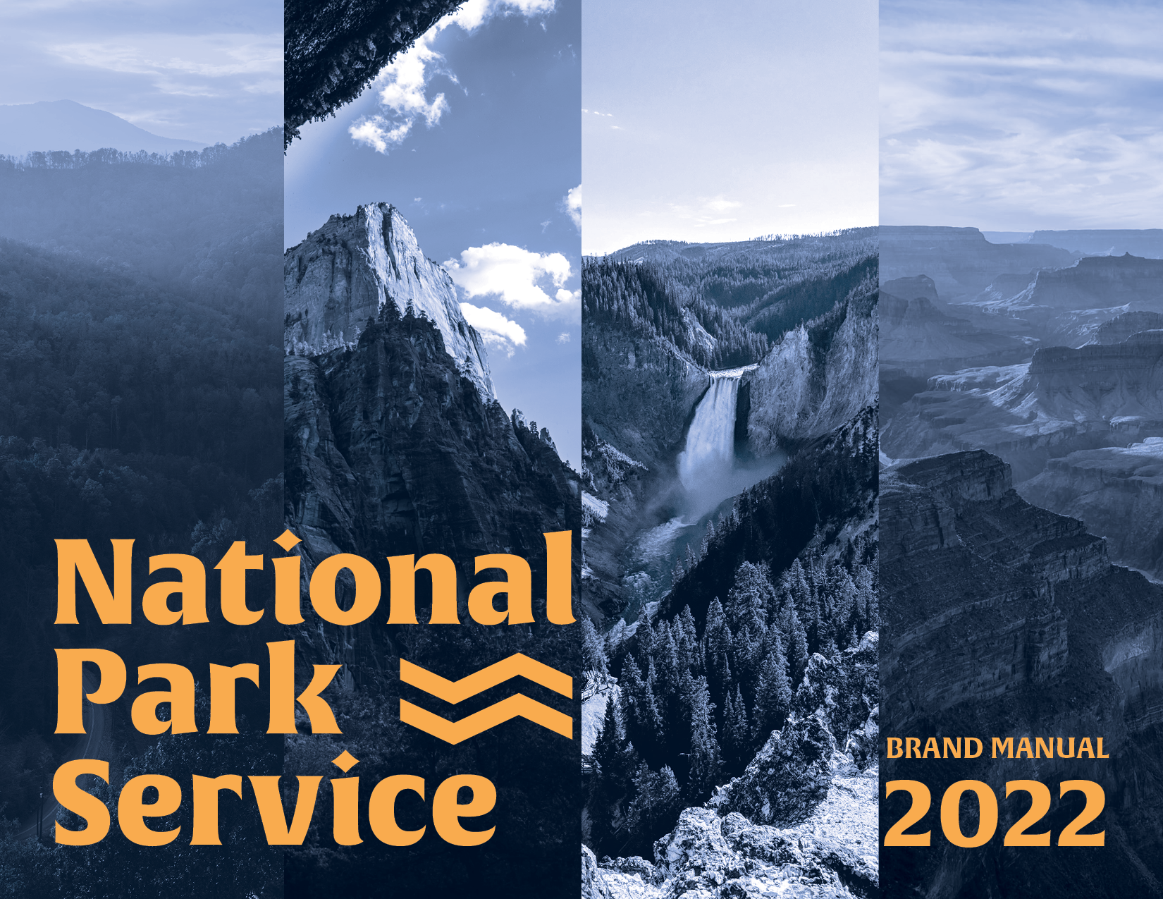
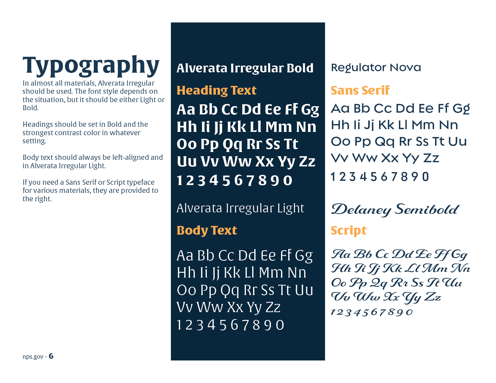
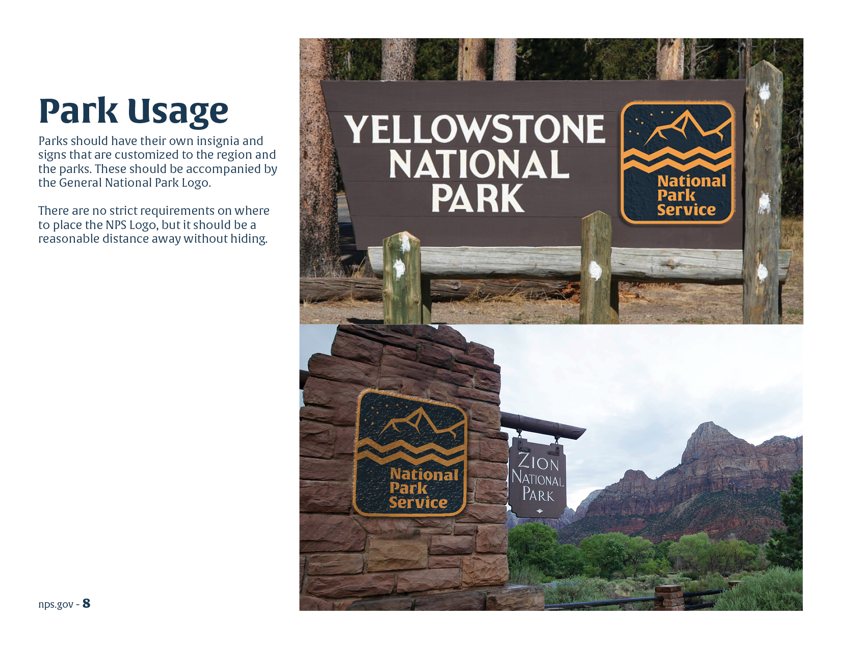
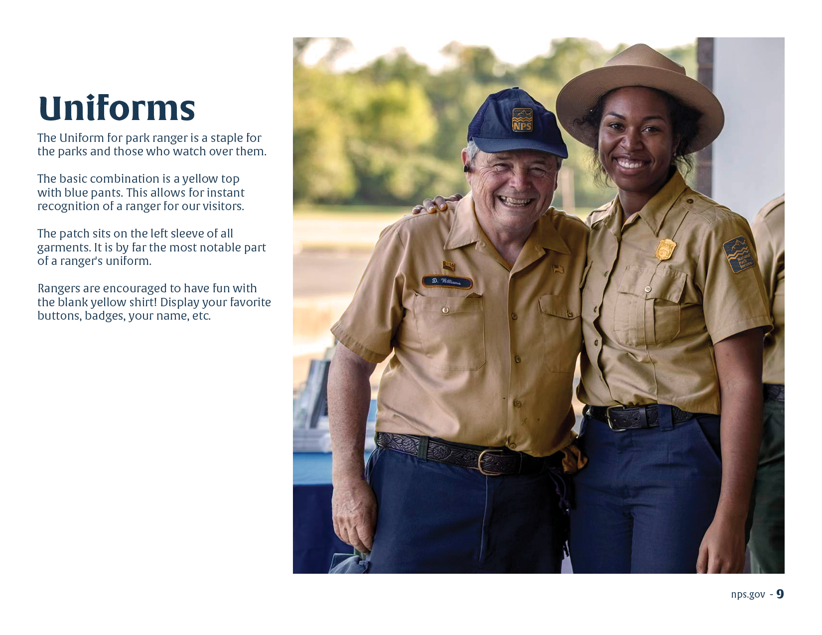
A full brand manual was made as well. It outlines ways to use the logos & design elements, and provides ways to use to the branding in outfits, letterheads, etc. Look through this below.
This project was the final project for the branding course Corey took in the Fall of 2022.


